Almost every Ren customer came through a sales-led rollout. For people to find Ren and try it themselves, the website had to explain it with no one from Ren in the room.
The old site read like it had been written by AI. I cut most of the text, replaced it with real product visuals, and designed the pages to flow one idea at a time.
Problem
Long, heavy paragraphs and very little to see, so visitors couldn’t tell what Ren did without a call.
Solution
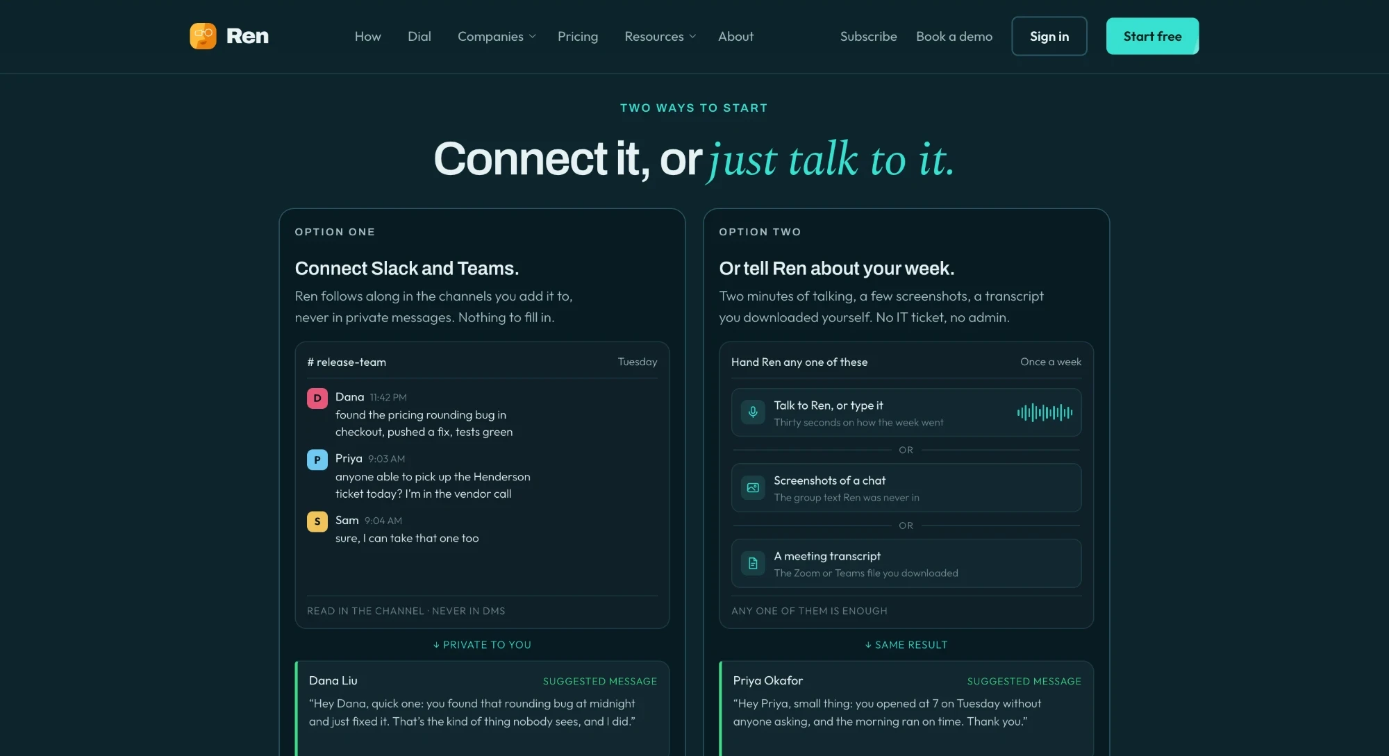
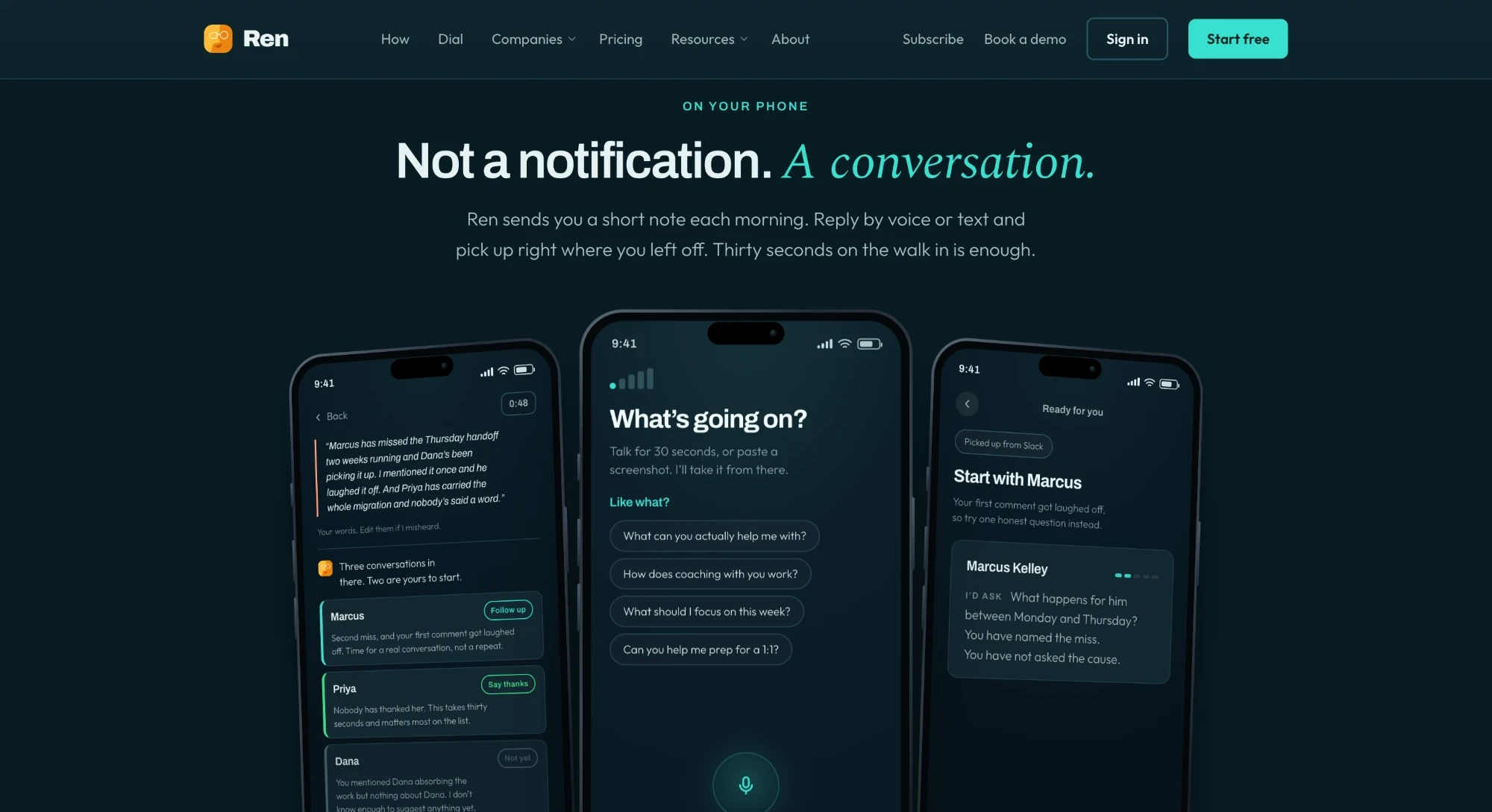
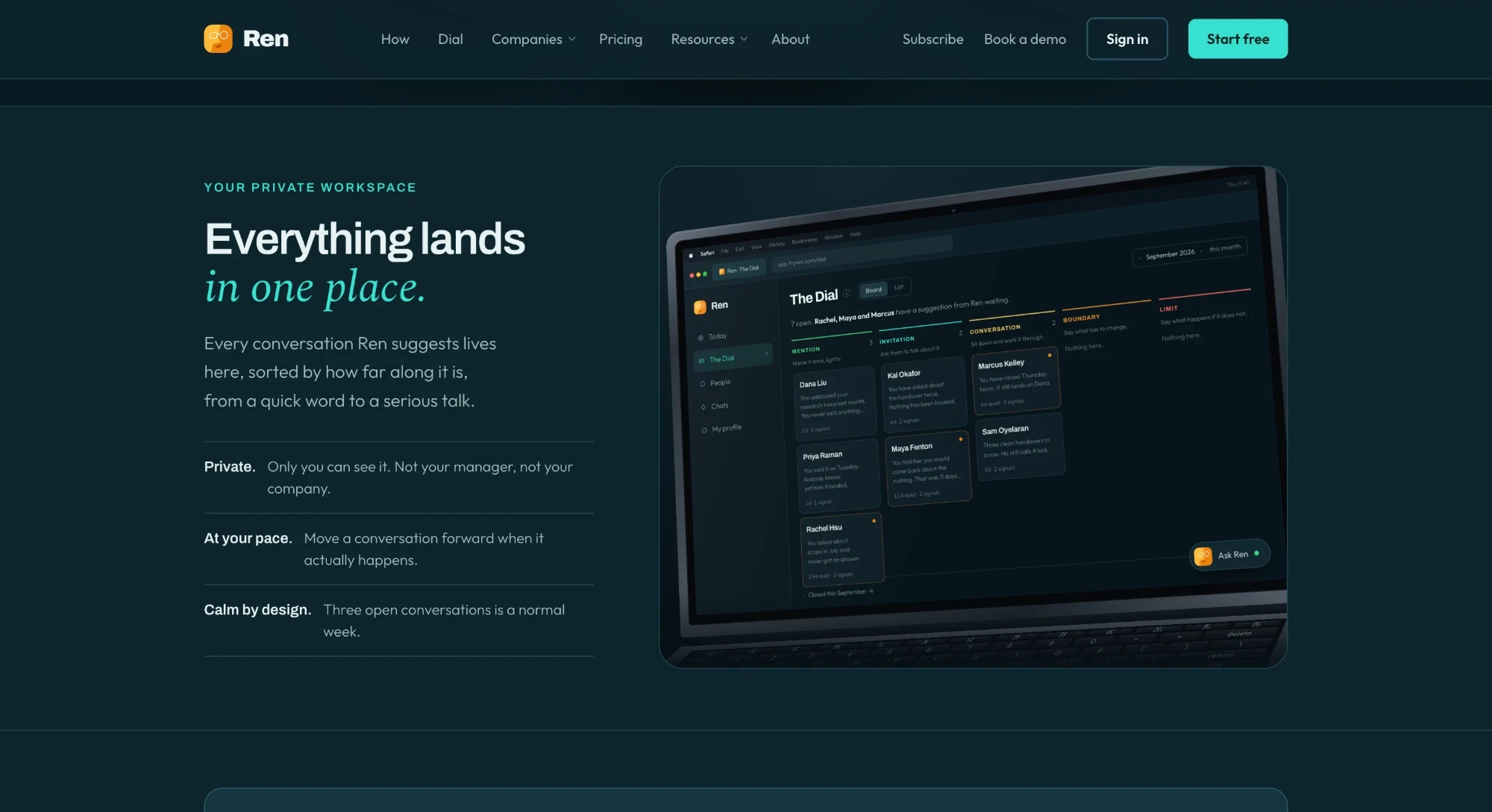
I rebuilt it around the real product: try one conversation in the hero, then how it works, the Dial, and two ways to start.
Results
Free-trial signups grew 60% after the relaunch, and I shipped 50+ pushes to production myself.
Ren needed a second way in
Almost every customer came through a sales-led rollout. For people to find Ren and try it on their own, the website had to explain it without anyone from Ren in the room.
Lead with what a manager gets, and show the real product
Drag to compare the homepage before and after.
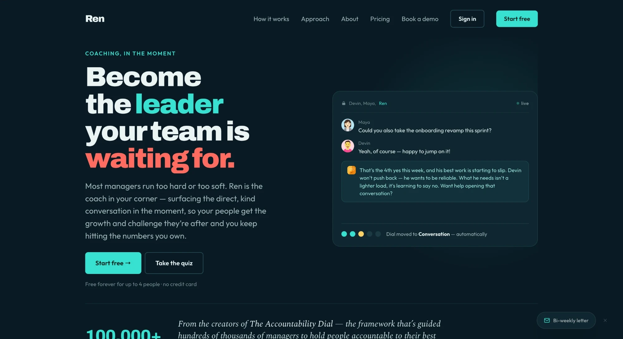
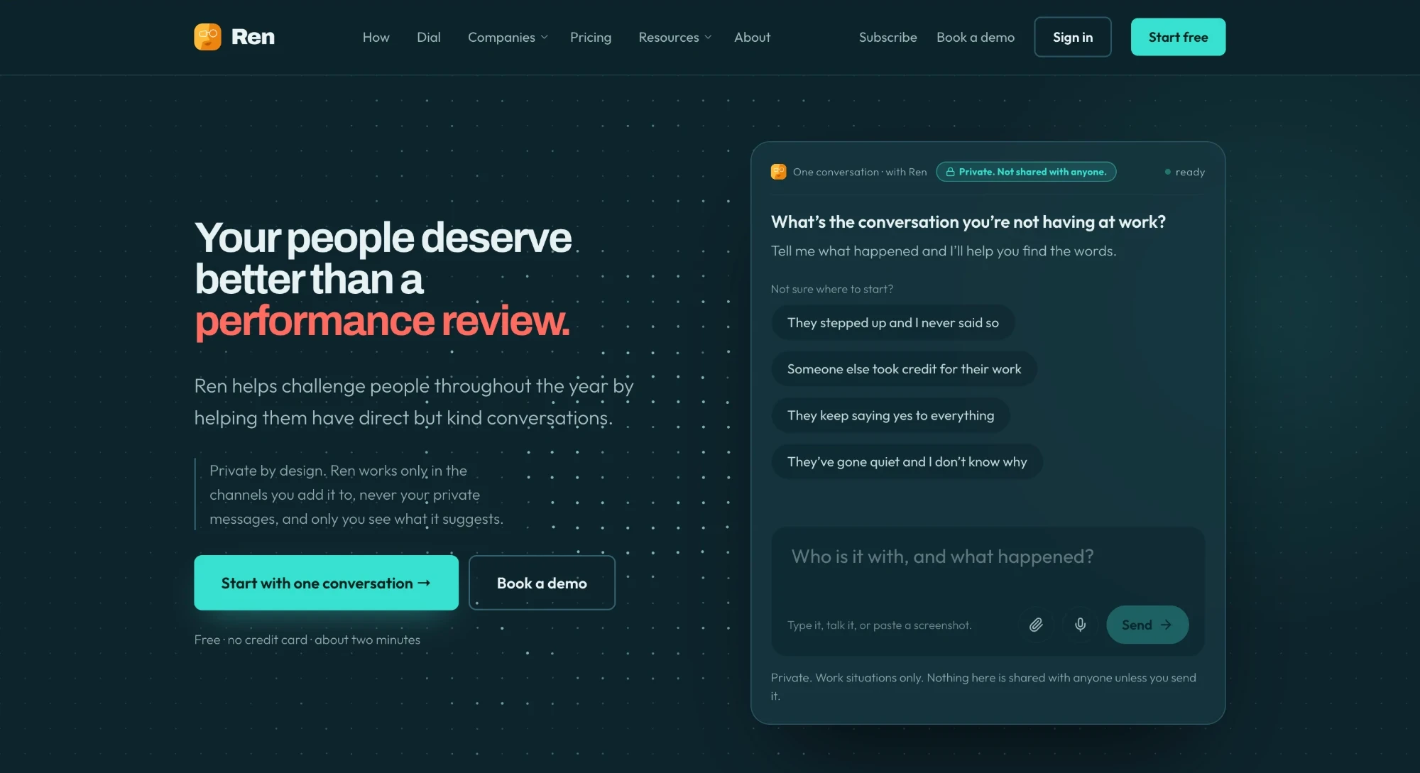
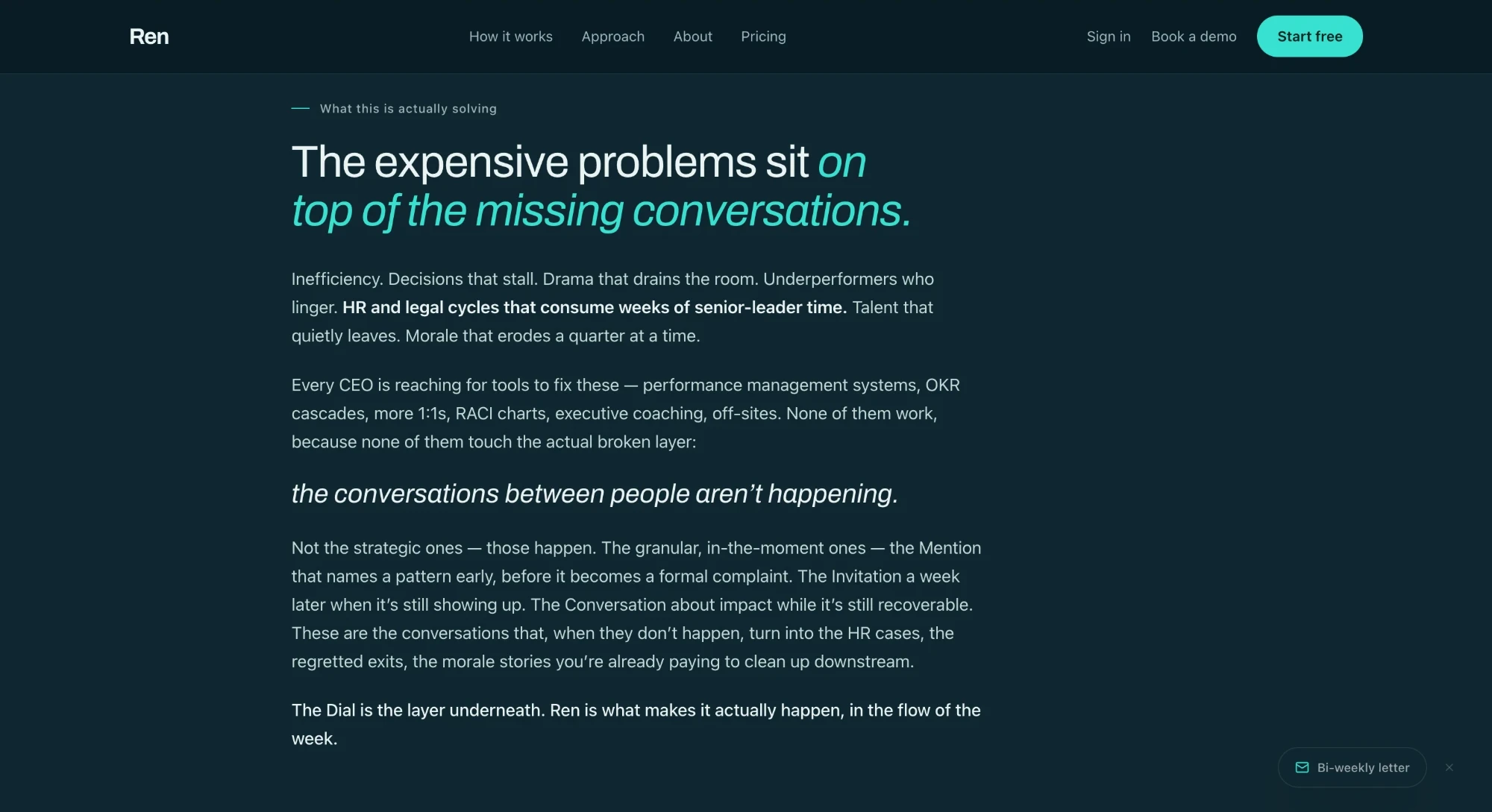
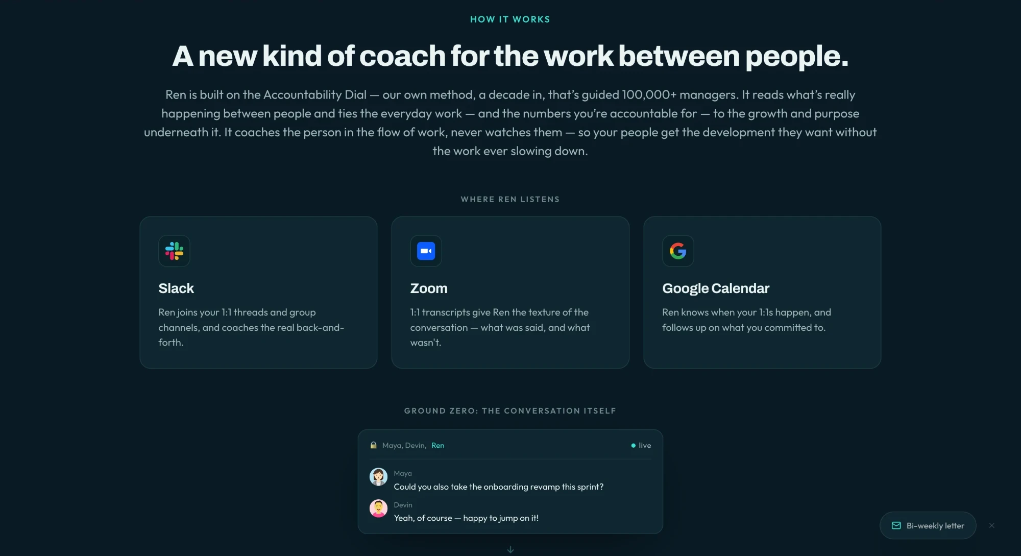
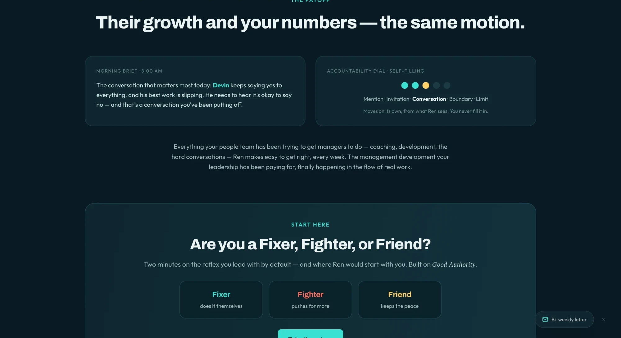
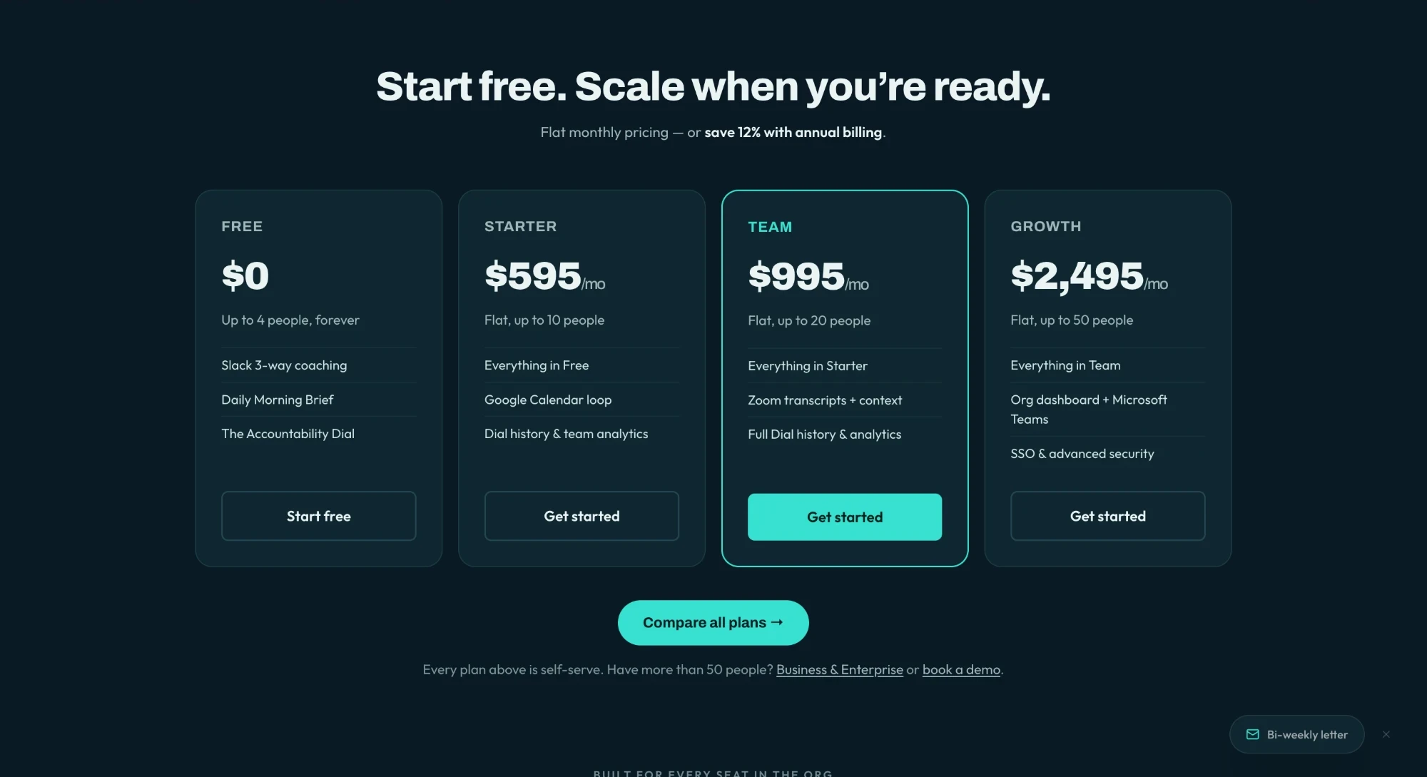
The old site read like it had been written by AI: long, heavy paragraphs and very little to see. I cut most of the text, added real product visuals, and gave the pages a natural flow, one idea at a time.
Lead with what you get
The homepage used to lead with what a manager might be missing. I rewrote it around what they get, and reordered it so the first thing you read is what Ren actually is.
Show the real product
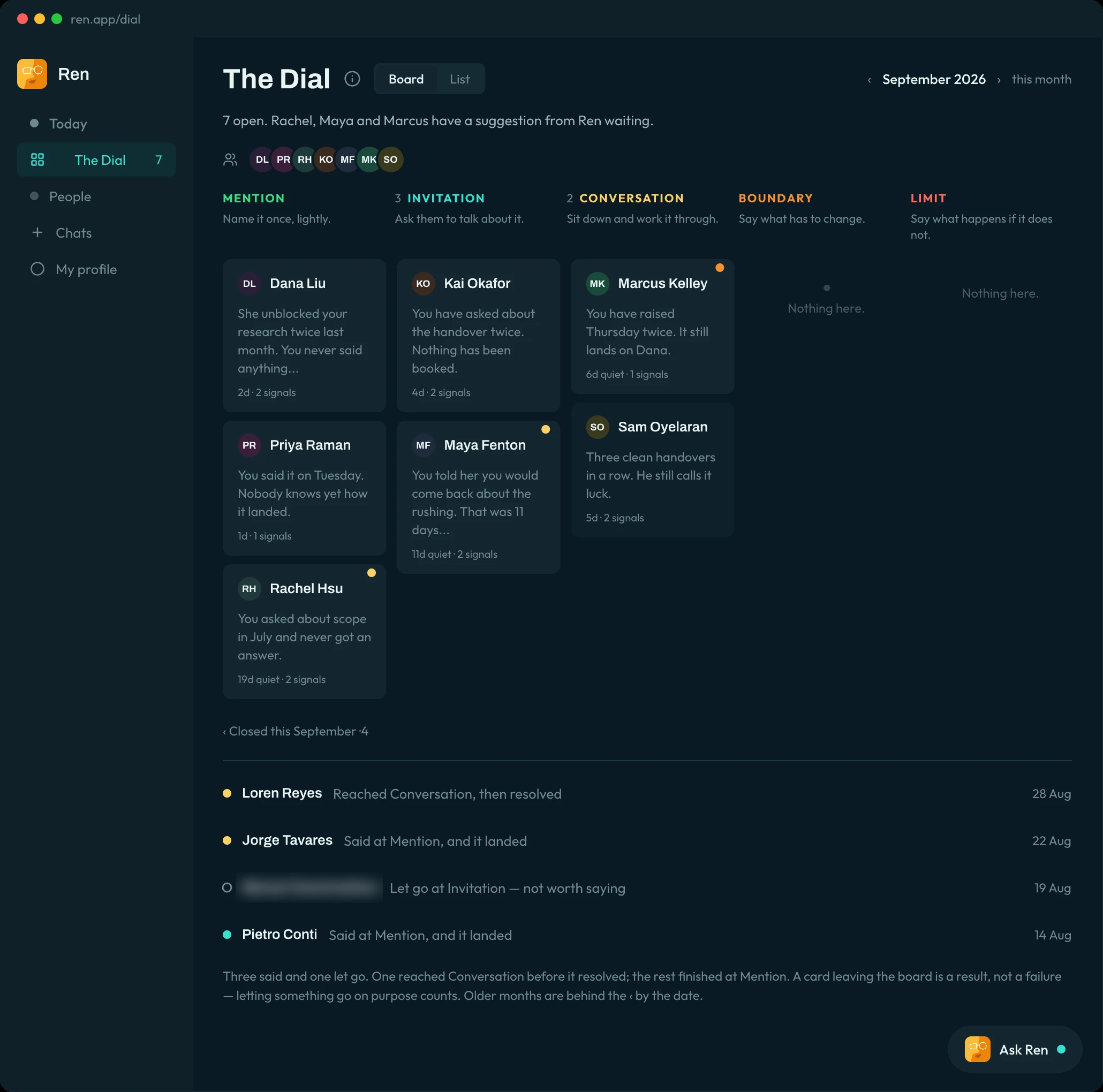
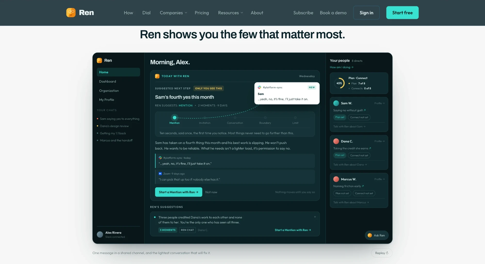
I rebuilt the product tour to mirror the real home screen, rebuilt how-it-works around real screens, and added an interactive version of the Dial.
Pages for the enterprise buyer
New enterprise and company pages, and a get-started page for rolling Ren out to a team, with announcement templates a team lead can send. That page answers the same thing customers said about the app: “I can’t explain it to my team.”
Getting found
An SEO push with new guides and comparison pages, planned with an outside consultant, and a redesigned blog.
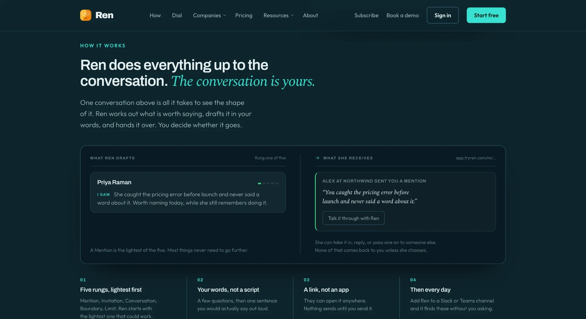
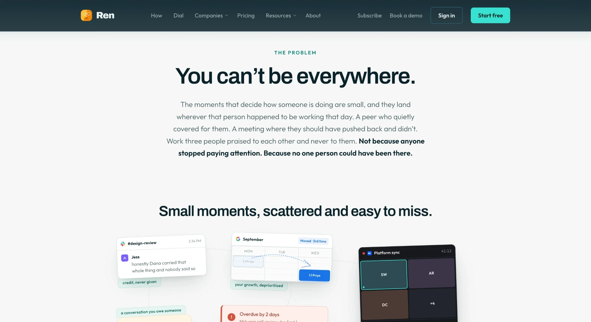
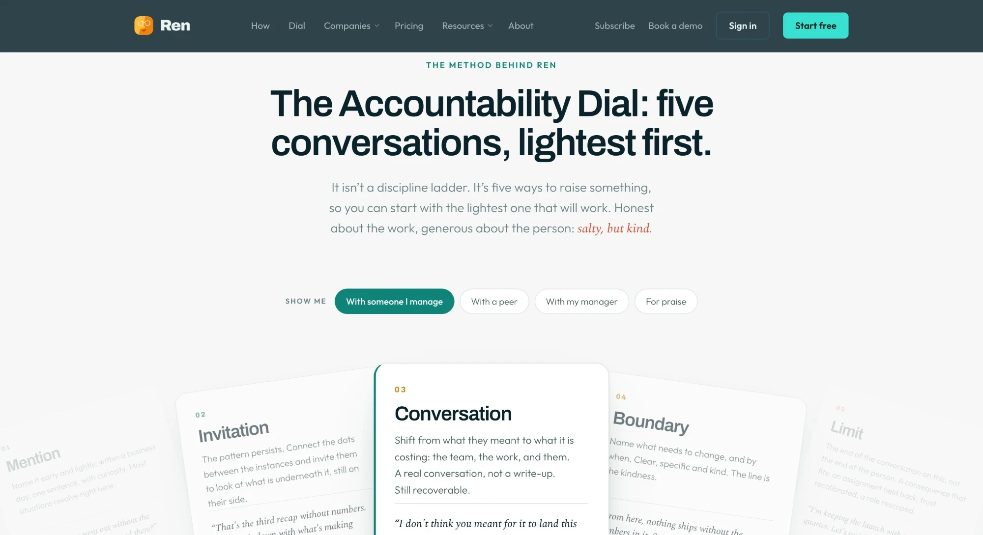
Getting it in front of people
I co-run Ren’s newsletter, which has more than 3,000 subscribers, and I made the product walkthrough videos we use so people can learn Ren without a call. I also ran a webinar push and moved a quiz from the app’s onboarding onto the website, where it could bring people in.
Trial signups surged after the relaunch
growth in free-trial signups after the relaunch
newsletter subscribers, co-run
The app redesign wasn’t live during the surge, so this is the website and go-to-market work. The redesign is what has to turn those trials into teams that stay, which is what the first day in the app is about.